Mike P. for Ward 3
CONSULTING
BRANDING
DESIGN
PRODUCTION
PROMO ITEMS
SIGNAGE
SPECIAL PROJECTS
Campaign Branding.
A local businessman leaned on Woodshed to help launch his political aspirations. The result was a bold campaign that leaned on nostaligic branding to balance the candidate’s progressive ideals.
See the project below.


Overview
When local political hopeful Michael Pasadyn decided to run for City Council in Westlake, Ohio, he knew that clear, cohesive branding would be key to connecting with his community.
Woodshed Creative partnered with the campaign to develop a complete visual identity and suite of promotional materials that reflected the professionalism and hometown pride of Westlake.
Challenges:
Political campaigns often face a unique challenge—standing out while maintaining trust and authenticity. For Mike Pasadyn, that meant creating a look and feel that was bold enough to grab attention but grounded enough to resonate with local voters.
A politcal newcomer with a long, hard-to-pronounce name starts the race with key disadvantages. He needed a memorable way to connect with voters.
We also had the challenge of capturing the personality of the candidate and extended it into his campaign branding. The candidate himself has a bold, larger-than-life personality, yet is as comfortable teaching elementary school kids how to tackle a runningback as he is negotiating multi-million-dollar commercial real estate deals. Never taking himself too seriously, he’s the kind of guy that everyone wants to grab a beer with and ask for advice.
The campaign needed consistent branding that could scale across print, signage, and promotional materials—all while maintaining a unified message and visual tone.
Solutions:
Woodshed began with a full campaign branding system, including logo design, color palette, typography.
The youth-sports coach’s campaign color scheme was inspired by the official colors of the City of Westlake, creating an immediate visual tie to the community.
The vibe was decidedly nostalgic, bold, and a bit casual, matching the personality of the candidate himself.
The ‘80s-inspired throw-back campaign branding theme strategically appealed to older constituents and young residents alike. The bold yet casual look matched the vibe of the candidate himself – full of bold ideas to help the city grow, yet without the stiffness and formality of the typical politician.
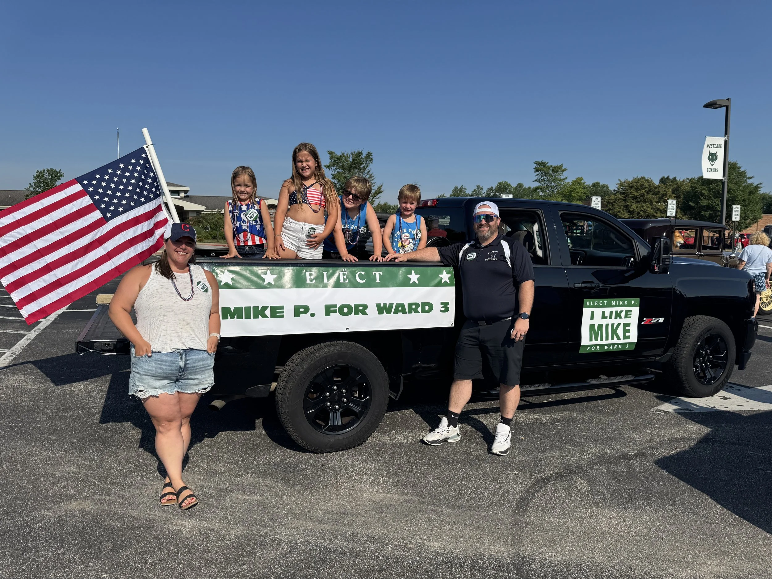
We created two campaign slogans to overcome the challenges of a long name that’s difficult to pronounce on the first try. “I like Mike” echoed a historical race for a hint of nostalgia with an easy-to-remember tagline, while “Mike P. for Ward 3” was simple, straightforward, casual, and bold.
From there, we designed and produced:
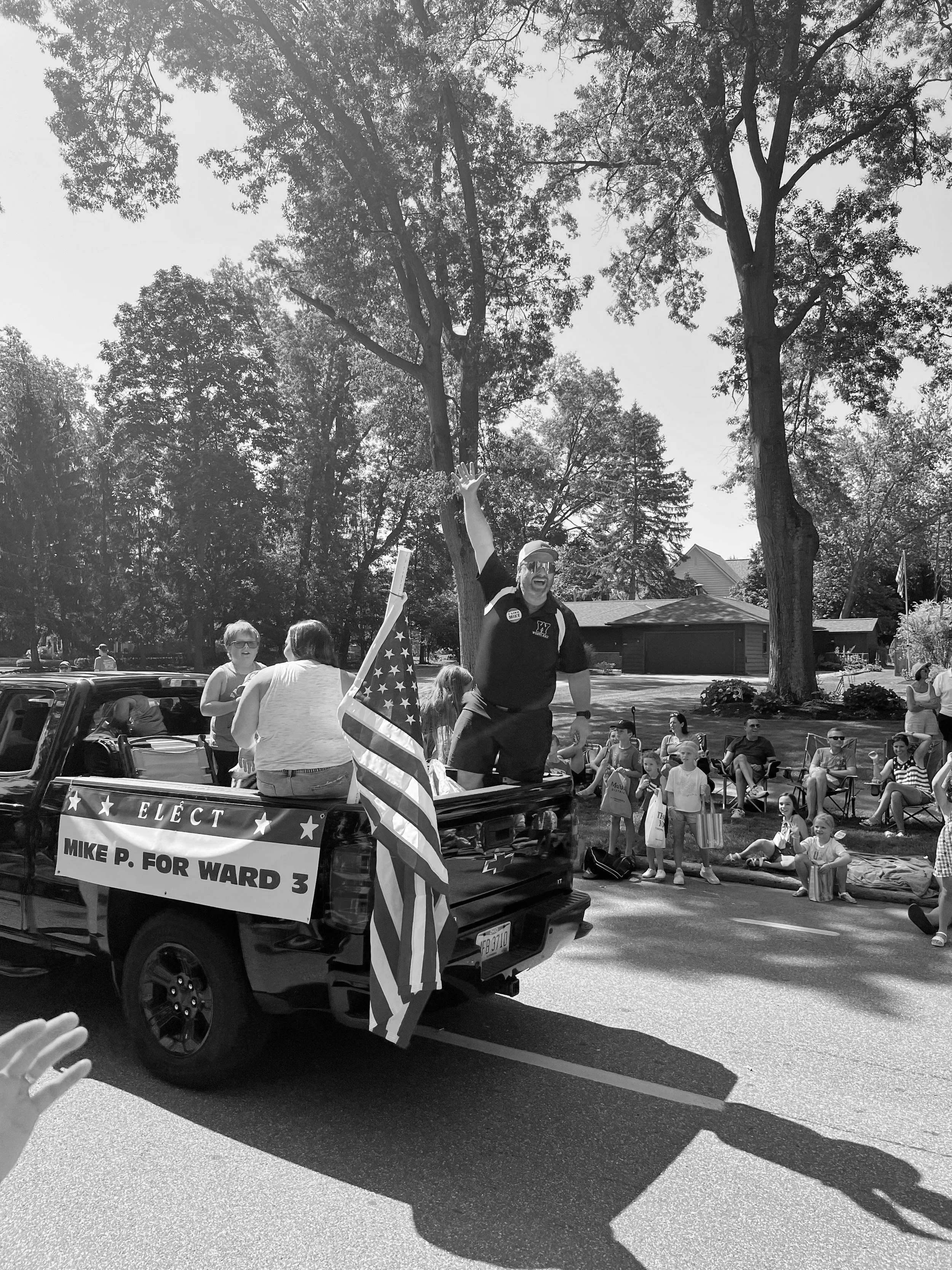
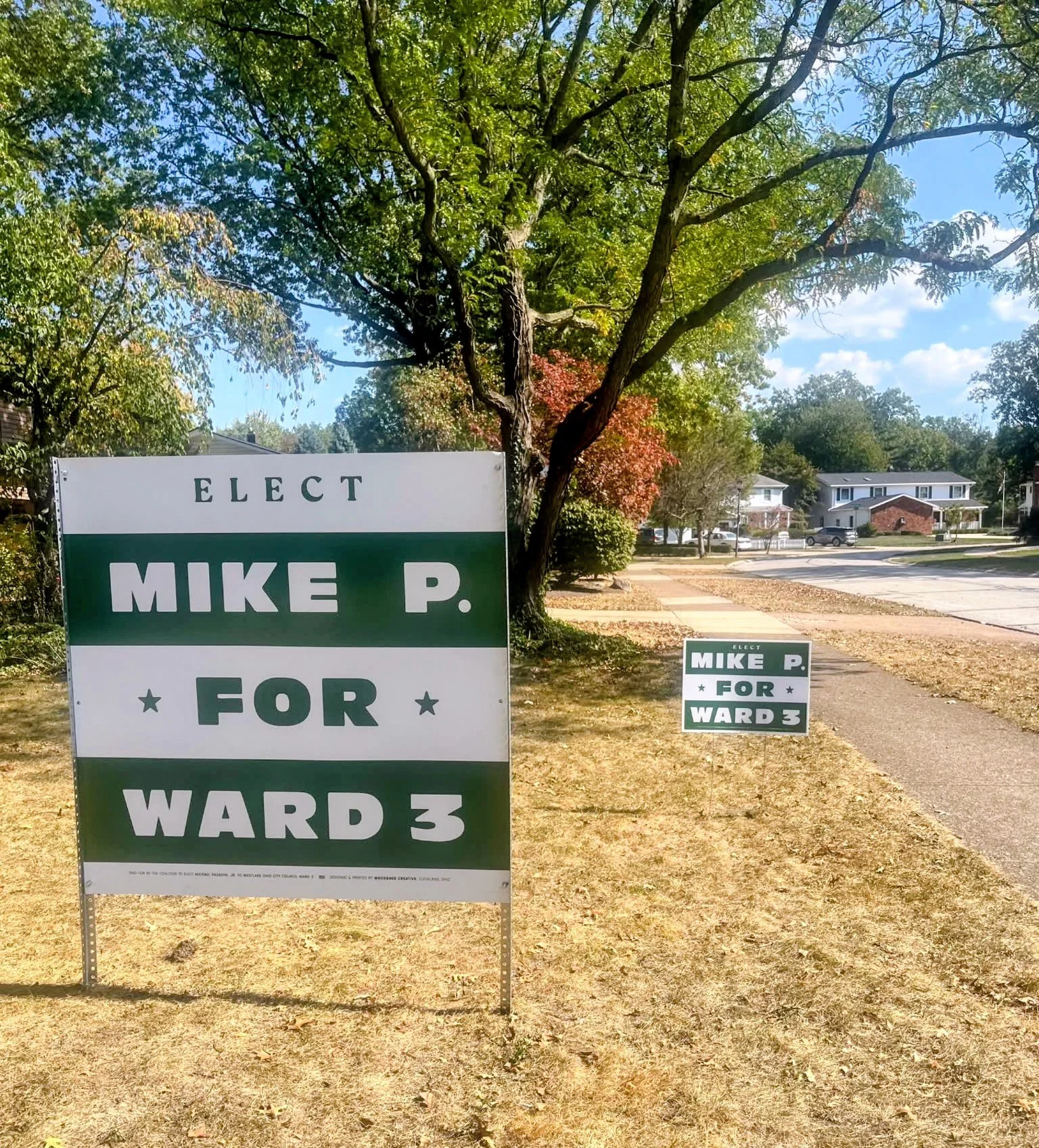
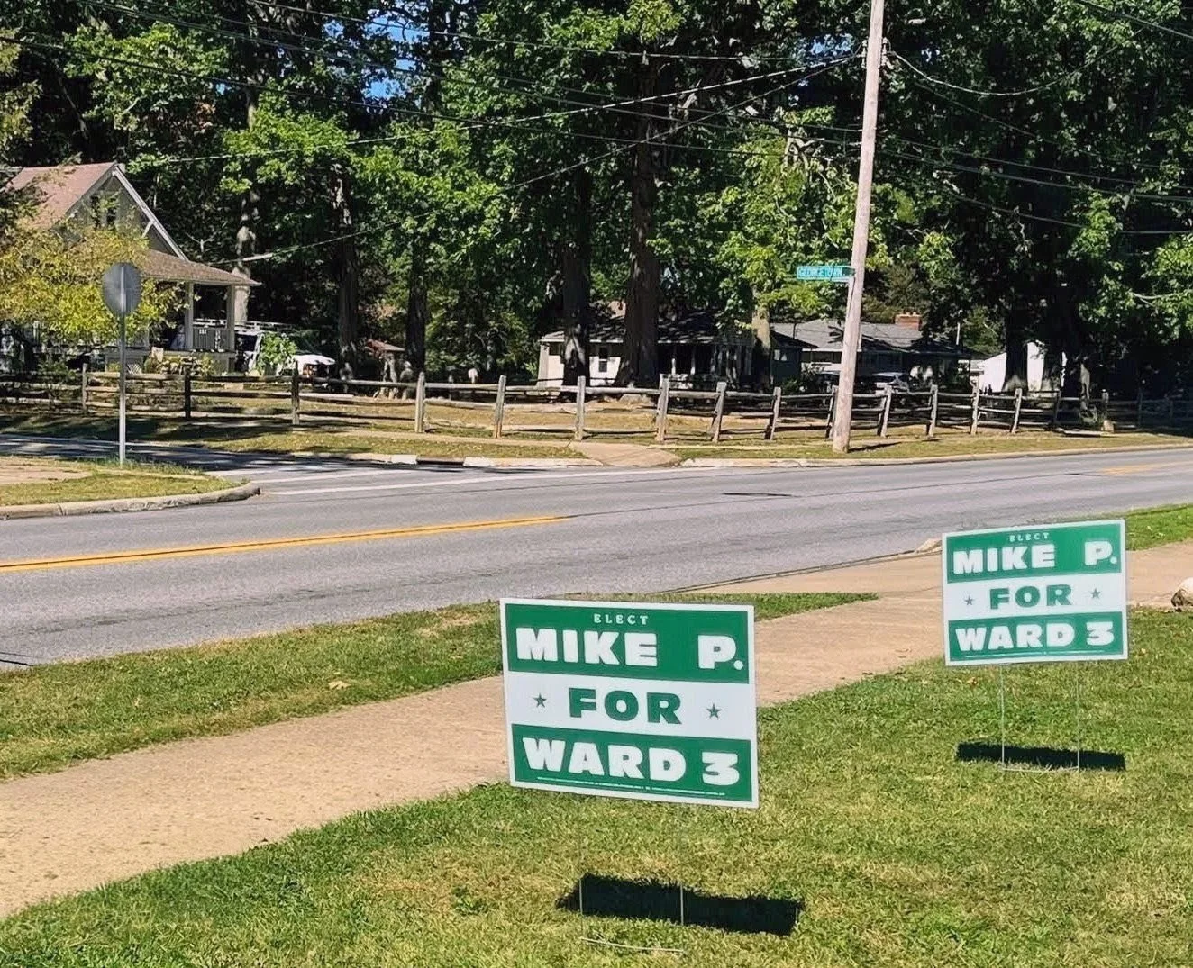
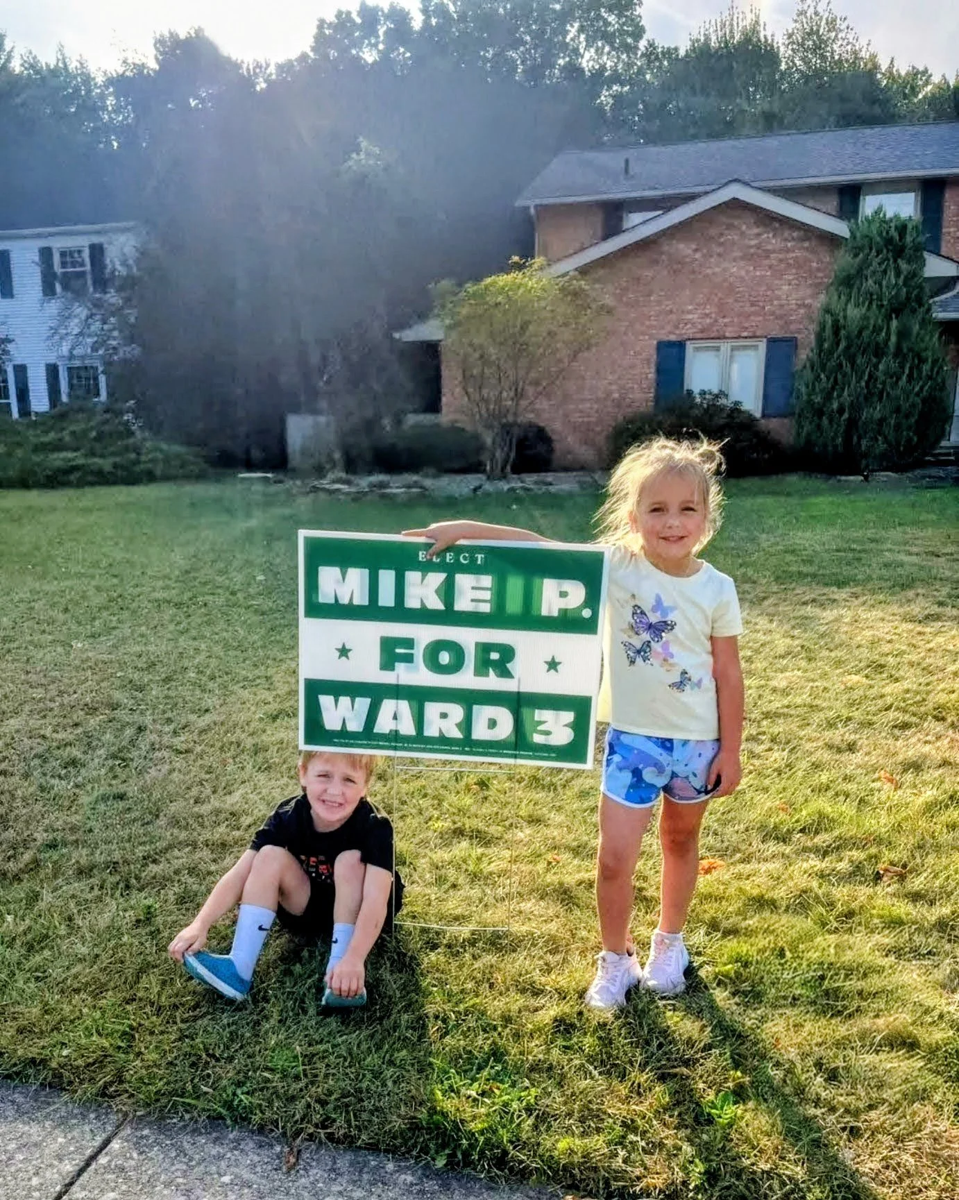
Campaign Signage – Yard signs, large-format roadside signs, vehicle magnets, and banners for maximum local visibility
Campaign Promo Materials – Door hangers, stickers, and buttons to reach voters directly and reinforce the campaign’s message
Every piece was designed to feel cohesive, professional, and unmistakably connected to Westlake’s identity.
Execution:
Woodshed managed the design and production of all campaign materials in-house, ensuring visual consistency and quick turnaround times during the busy election season. The final suite of materials helped establish a strong, recognizable brand presence for Mike Pasadyn’s Ward 3 campaign—one that will carry through every touchpoint of his first run for City Council.
__
For more information, visit the official Mike P. for Ward 3 Facebook page.